At the Amanpuri in Phuket, Aman has enlisted Japanese architect Kengo Kuma to design a holistic pavilion to house a new retail concept. Reflecting Aman’s philosophy, the structure fuses traditional principles of Asian architecture with modern design with its rhythmic formation of floating roofs acheived through progressive engineering by Kengo Kuma and Associates

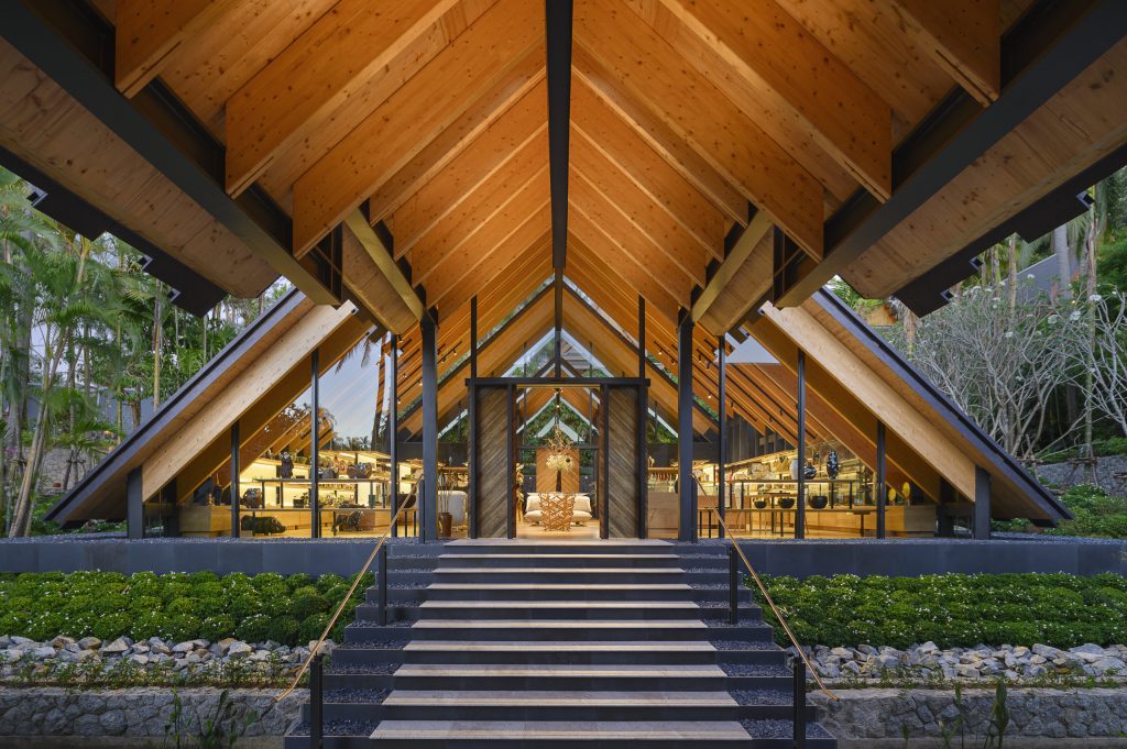
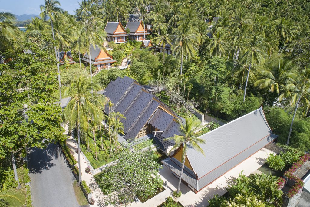
Kengo Kuma’s retail pavilion at the Amanpuri is built on sloping land and features a series of stepped roofs.
It is Kengo Kuma’s ‘nth visit’ to the Amanpuri hotel on the island of Phuket in Thailand, which he first visited nearly 30 years ago, and it’s no wonder that the internationally renowned Japanese architect feels content here. On this paradise peninsula, abundant with nature and peacefully dotted with pitch-roofed pavilions, who wouldn’t?
Yet perhaps it’s because Kuma and the Aman hotel brand both have some philosophies in common – the fusion of eastern and western cultures, the embrace of nature and simplicity, and a forward-thinking approach combined with traditional values.
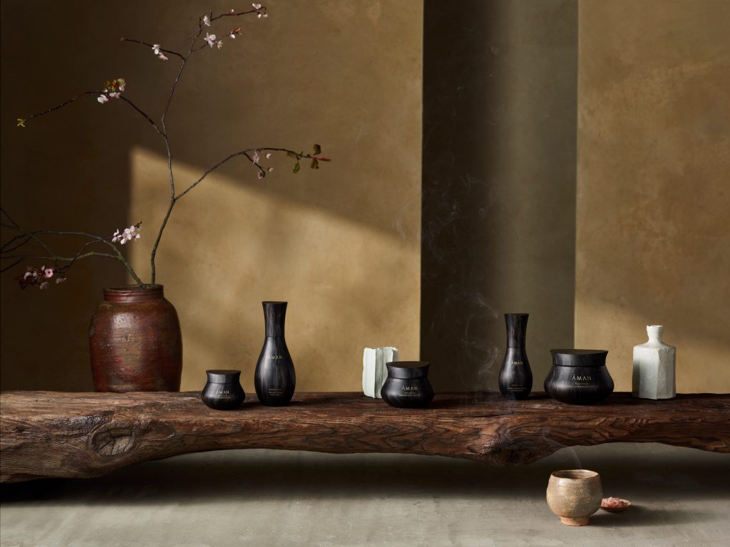
Their relationship was further forged when Kengo Kuma and Associates (KKAA) designed a unique range of bottles for Aman’s new skincare range, released in 2019. So when Aman decided to embark on adding a new retail store for the Amanpuri, the first of its kind of the Aman brand, there was sure to be a meeting of minds.

KKAA sensitively designed the new pavilion to connect with the existing architecture by Ed Tuttle, and the lush, green natural environment of the resort.
With its peaceful setting and contextually sensitive design, the Amanpuri was the first Aman that set a high precedent for every destination (32 and counting) that then followed from Bali to Utah. Designed by architect Ed Tuttle in 1989, the resort is defined by its nature-immersed village of private pitched roofed pavilions connected by stepped pathways, inspired by the ancient Thai capital of Ayutthaya.
It was a good place to start for this first store, intended as a prototype for more to come, imagined as a curated stage for the best local and international design objects, clothing and jewellery. ‘This is a shop, but the concept of the shop is far beyond a shop,’ says Kuma, who has crafted show-stopping retail environments for Camper in Barcelona and Valextra in Milan. ‘We designed the space as a museum of the Aman resorts, where space has a special conversation with the philosophy behind the art and the product.’
‘Intimacy and human scale are important to both Thai and Japanese architecture’ – Kengo Kuma

Beautifully framed by KKAA’s columnless design, every piece for the store has been handpicked by the retail team at Aman. From the softest bamboo and cotton mix leisure-wear, to the Kengo Kuma-designed Aman skincare range, and modern pieces informed by traditional craft – such as unique art objects from Lotus Arts de Vivre’s Bangkok gallery, atta grass bags handcrafted in Bali by Stelar and gold-lined bronze works by British-born Alexander Lamont, the offering is diverse and eclectic.
KKAA’s holistic approach imagined how an Amanpuri guest might find their way into the space – being visually welcomed by its soft geometry on arrival to the resort, casually meandering through from the spa, or walking through the entrance pavilion on the way back from breakfast perhaps. ‘The space is about the site and the pathway,’ says Kuma, ‘we just happened to cap it with a series of roofs’.
KKAA positioned the lighting to create a sense of procession, refined the edges of the shelving, and added specially tailored MA and KA sofas designed by KKAA in collboration with Time & Style, to create a central ’Living room’ space for visitors.
While the pitched roofs and strong axis of the building echo the traditional Thai architecture that informed Tuttle so strongly, there are some subtle differences to Kuma’s more Japanese approach, explains Balazs Bognar, design director at KKAA. ‘If you go to some of the temples in Bangkok, you can see series of stupas that appear like objects or talismans that you really cannot inhabit. In Japanese examples, it is about entry, sequence and the in-between. Our pavilion is about sequence, spatial flow, continuity.’
Both remarkably sculptural and beautifully precise, the layered roofs of the pavilion dissolve into their lush leafy environment, where the dark tiles absorb the midsummer light. This perceived lightness and simplicity however hides the challenge that came with combining two structural systems, one of cross-laminated timber, and one of steel, with glass partitions.
‘Creating the gaps between the roofs was not easy – structurally it is totally separated, and each roof is independent,’ says Kuma, who owes his success in combining the latest technology with traditional Japanese design principles, to collaborating with engineers from the very start of the design process.
The engineering explored in this pavilion has also been used for the Tokyo New National Stadium project, which uses the same system on a larger scale: ‘We learnt much from this experience to pass to the new building which will be one of the most unique CLT buildings. It is higher, with a bigger void and natural light comes through the gaps between the CLT panels,’ says Kuma.
The stepped roofs layered with glass in between create rhythmic reflections of the environment and the architecture.
All of this effort is geared towards helping the architecture diffuse into nature following the principles of Kuma’s 2008 thesis Anti-Object. Here at the Amanpuri pavilion, natural materials are at the forefront, construction is exposed, and a very special lighting effect occurs: ‘The light is filtered, which we call the komorebe effect, translated as ‘dappled light’. In the forest you feel dappled light through the leaves, and here we have tried and create that kind of atmosphere.’
A powerful connection to the earth is created by the sweeping roof composition, which grazes the sloping ground and shades the building with its extended eave. At the same time it also extends up high – the tallest roof is 9 metres, giving the retail space a special presence, like that of a museum, yet still levelling to a similar height to the neighbouring gallery pavilion.
‘Thai architecture and Japanese architecture both have some vocabulary in common,’ says Kuma. ‘Intimacy and human scale are important to both cultures, and sculpting the roof is one solution to creating intimacy. In Japanese architecture, we use the soffit and a small entrance to mediate the exterior and the interior, it’s a kind of Asian wisdom and a solution for [connecting the building to] the environment.’
Capturing both the dignity of a museum and the warmth of a living room, the pavilion might have been designed as a pathway that falls into step with its surroundings, yet it has also been designed as a new extension into the future for the Aman brand. And we have a feeling that this is just the beginning of a very fruitful journey for KKAA and Aman. §
In the forground, a limited-editon-of-10 Kigumi table designed by Kengo Kuma and engraved with his signature: ‘The Kigumi table was designed as a kind of architecture. ‘Kigumi’ means braid or plait in Japanese, and structurally it is very challenging, like architecture.’
A covered pathway connects the pavilion to the Amanpuri gallery space that will feature seasonal exhibitions of contemporary Thai art and antique artworks, objects and artefacts.
Read the full article: https://www.wallpaper.com/travel/kengo-kuma-amanpuri-retail-pavilion-phuket-thailand